This article is also on Medium, where images may load better. Please feel free to leave comments!
The team at By Implication does a lot of thinking about the difficulty of transport and commuting in Metro Manila. The problem is messy and multifaceted — it involves infrastructure, planning, inherited problems, population density, and so much more.
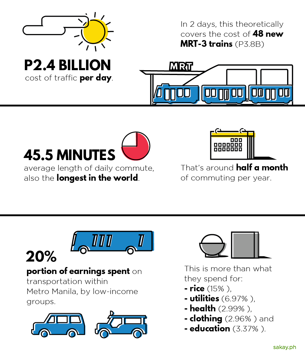
Infographic by Patsy Lascano / Sakay.ph — Data from Philippine Star, GMA, JICA Transport Study, Inquirer.net
While we (obviously) can’t address all of these with an app, we can fix the problem of information. We can help make routes more well-known, more clearly understood, and more easily accessible. For the most part, we do this through our app. We’ve been working hard to make our app and website the best online resource, but we’ve often asked ourselves: How and where else can we make the information more approachable?
Turns out, we just had to look up from our screens.
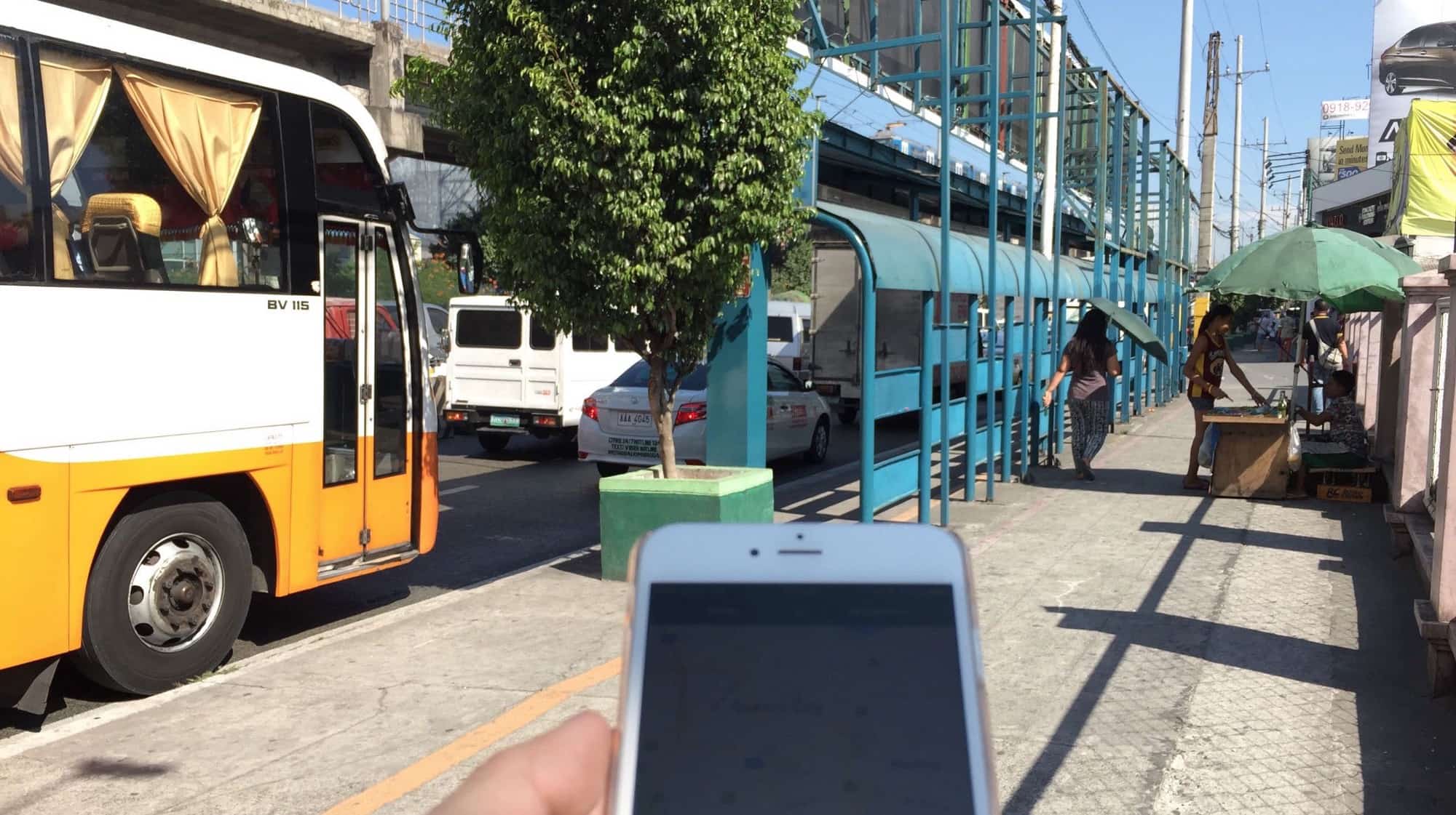
This is a bus stop along EDSA that’s pretty near our office.
An experiment
We do a lot of internal studies and experiments at By Implication. Many don’t see the light of day. But we’ve decided to publish this exploratory project: a partial redesign of the way Metro Manila does signage for buses and bus stops.
We decided to focus on bus routes along EDSA. They’re commonly referred to as the “ABC System”, because there are three primary routes — A, B, and C. Each of these has their own sets of stops.
We’re focusing on this small subset of commuting for two reasons. One, we’re a small team, and don’t have the resources to redesign absolutely everything. Two, the ABC system is one of the most heavily used routes, running along the backbone of Metro Manila. As such, a redesign here stands to impact a large number of people, and can serve as a basis for other lines and systems (like the MRT, LRT, Pasig Ferry, bike lanes, and more) to follow.
Remember that because of these constraints, this redesign is in no way comprehensive. We may make wrong assumptions or overlook some use cases. We hope you’ll understand, and join in the conversation about improving design and transport in our country.
Foundation

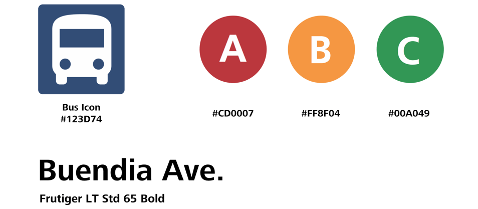
Let’s start with the colors and visual hierarchy. We decided that signage across a particular transport mode should have a strong main color, which makes each sign recognizable and distinct. (For example, all MRT signages might be purple, all bike lanes might be green, and so on.)
In this case, we decided the buses should be predominantly blue, and that there would be sub-colors for the A, B, and C lines. The three colors are easy to spot and are very distinct from each other.
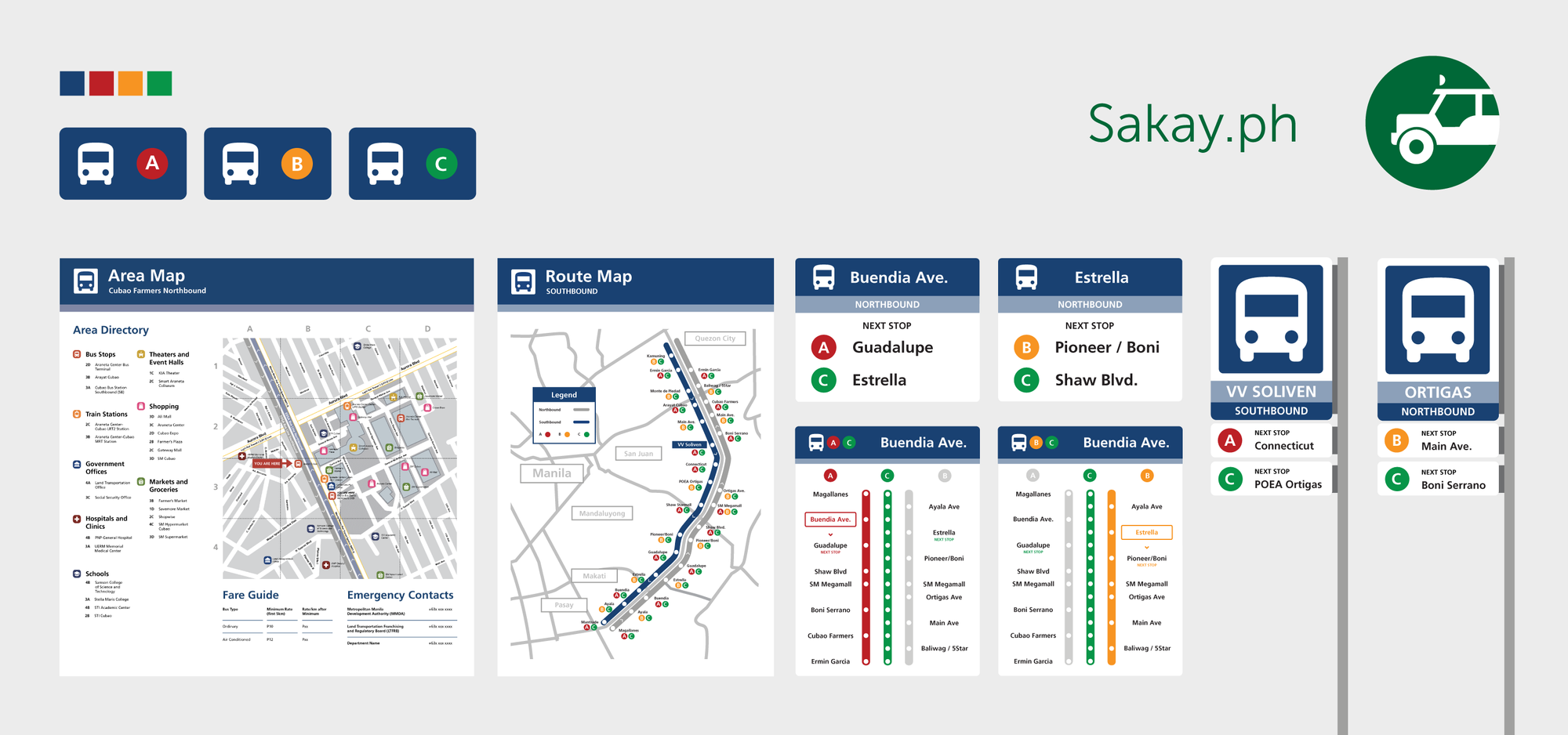
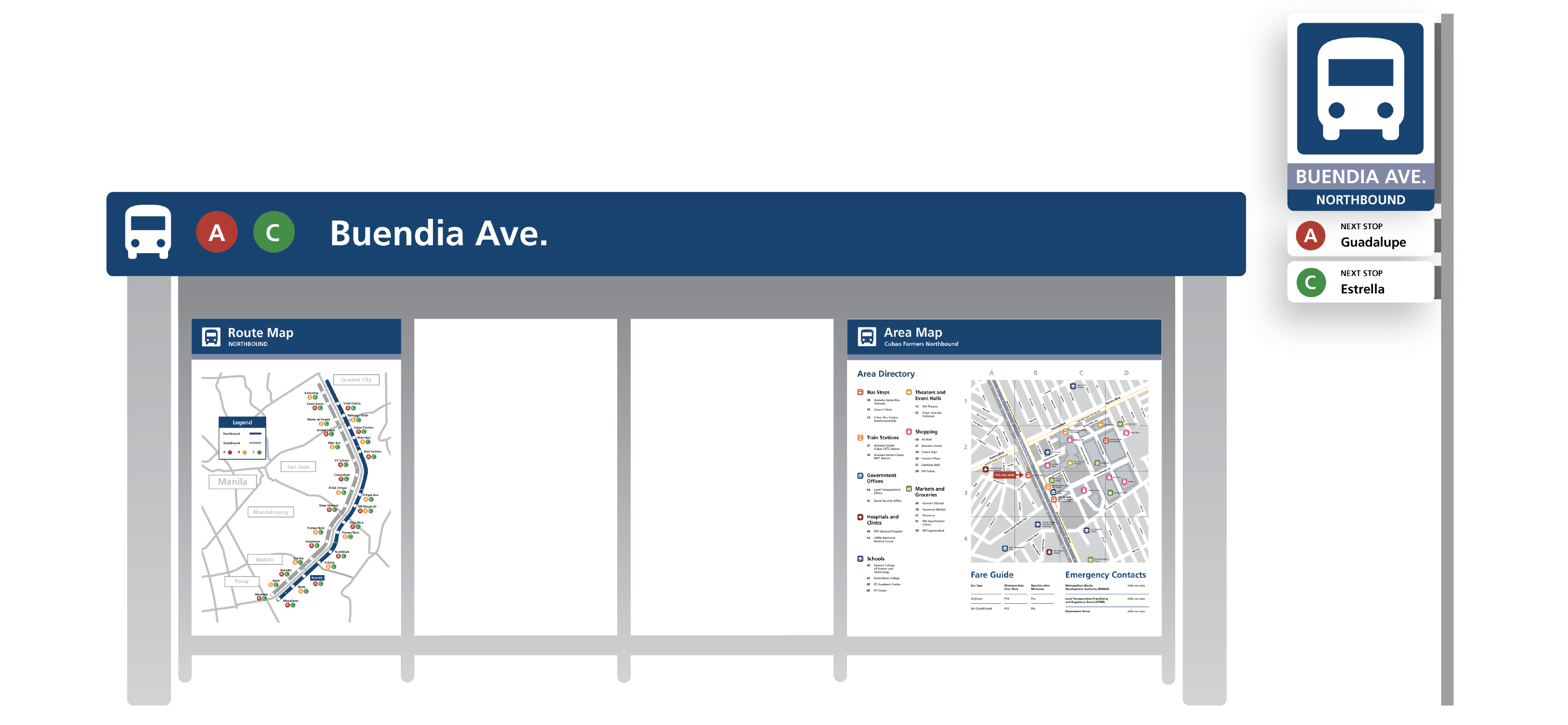
Main Signage / Identification
Let’s now look at a typical stop.
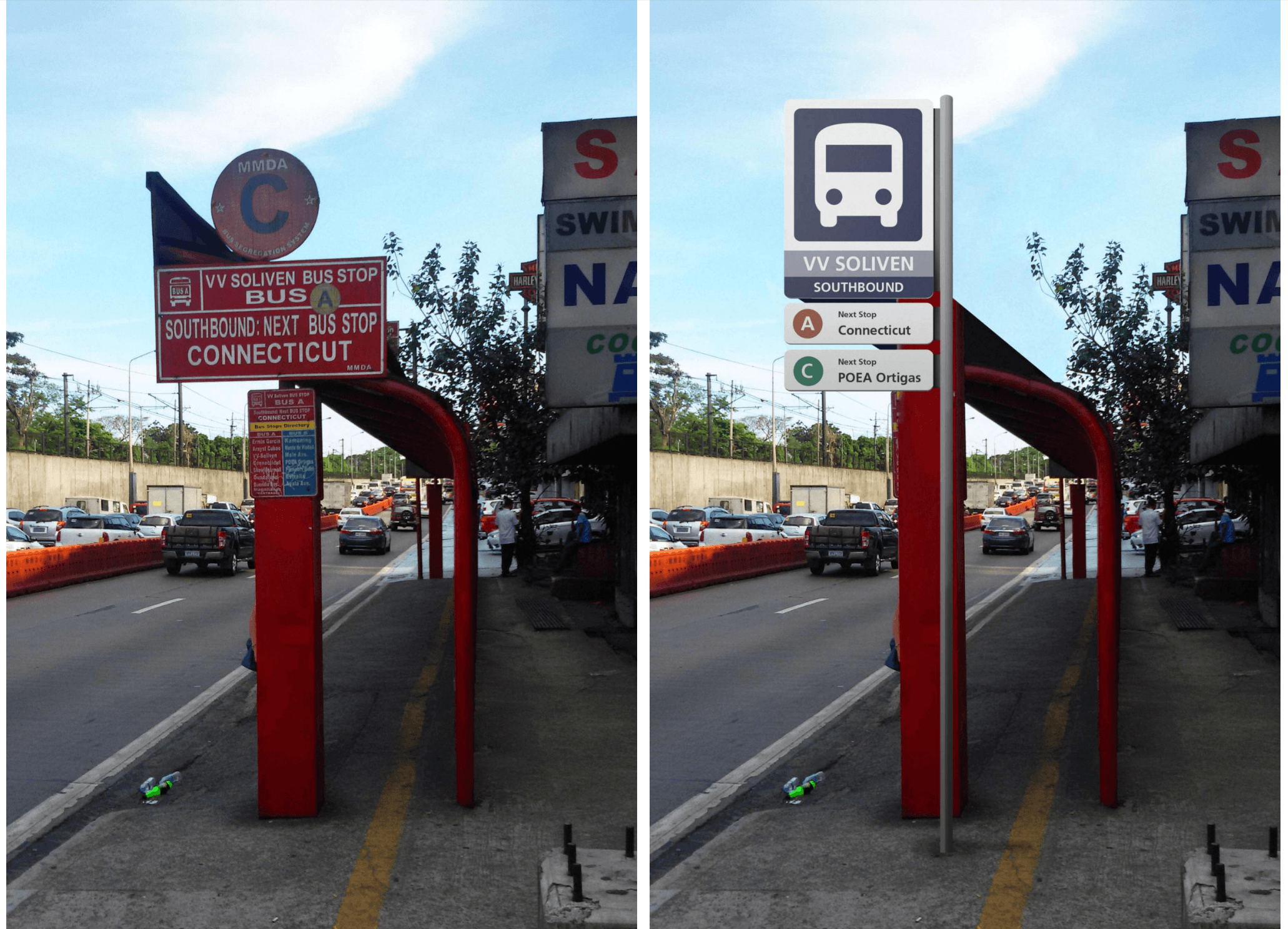
Before and After. These photos are a little easier to see on the Medium post.
There are several important pieces of information a commuter needs to see from afar: what transport mode the stop belongs to, what lines stop there, and where the transport is going ( the direction of travel and the next stop). Signage right now is fragmented across multiple panels, so we consolidated everything as such:
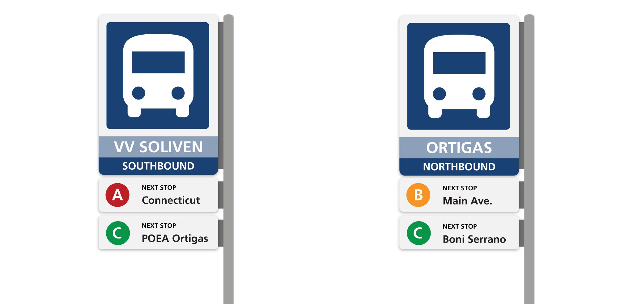
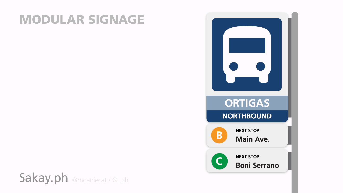
We have one large sign which shows a bus icon (this replaces the need for the words “bus stop”), the stop name, and whether the stop is north or southbound. Underneath the large main sign are smaller signs indicating the types of buses that are served by the stop and the next few stops of each. These smaller signs are modular so routes can easily be added, removed, or modified in the future.
So now people know what stop they’re looking at from afar, and they walk up to it. Great! Problem solved — but not quite. Now that commuters are waiting for their bus (or train), they may have other concerns: Which stop should I get off at? How many stops away is my destination? And once they do reach the right stop, they may have more questions: Where am I supposed to go now? What’s nearby?
Supporting Interior Signs
Interior signs are important for these reasons. They give the commuter additional context: information about his or her desired destination, and its immediate area. Information is denser / more detailed in these signs, because we expect commuters to have some time to look through them, while waiting for the next bus. There are three main groups of signage — we redesigned two, and added one:
Stop Information and Route Directory
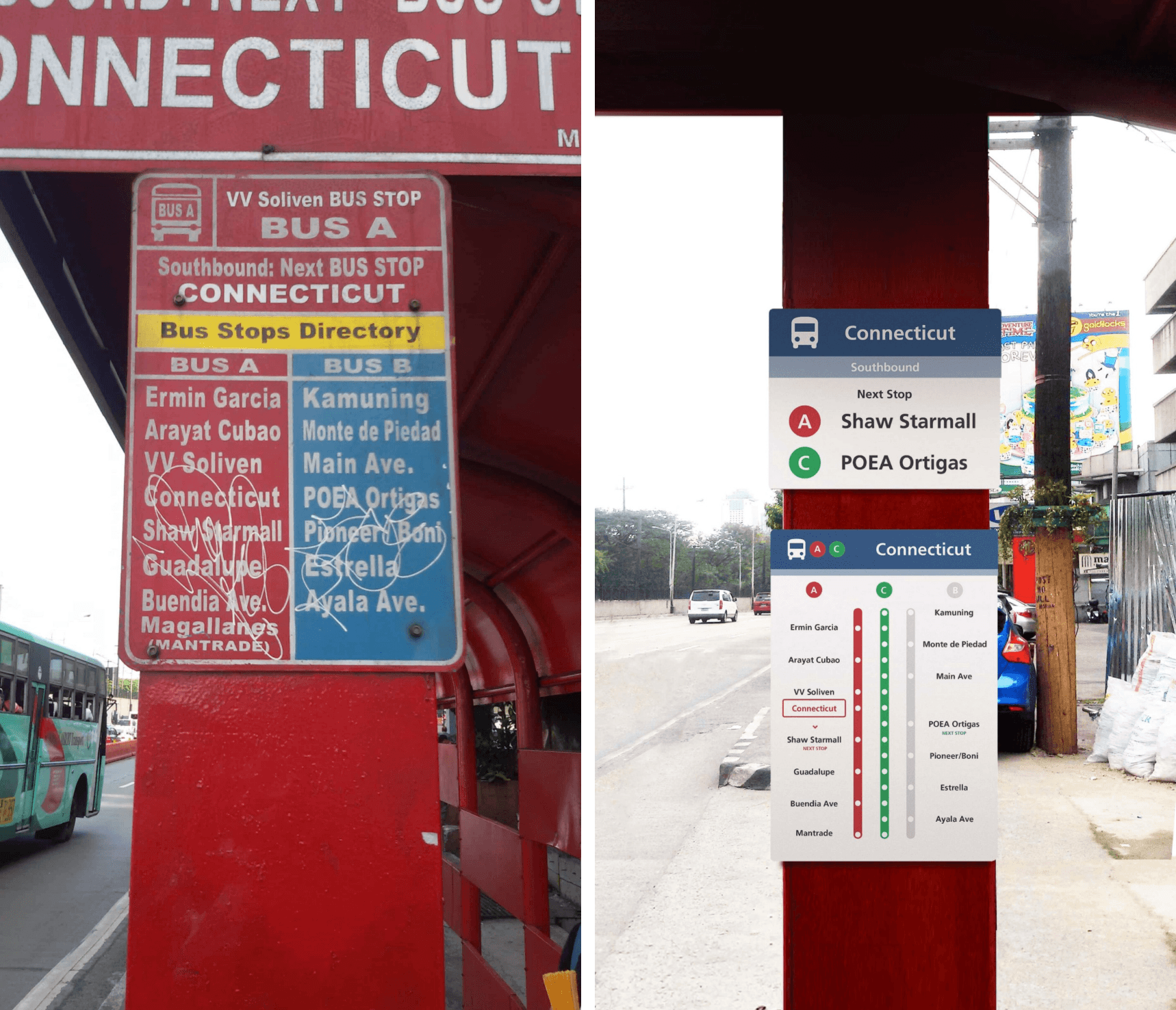
Before and After. These photos are a little easier to see on the Medium post.
We split the existing sign showing the current stop and list of other stops into two. This makes the hierarchy much clearer and helps the user easily grasp information.
The stop information is just a smaller version of the main signage, to make sure people know where they are.
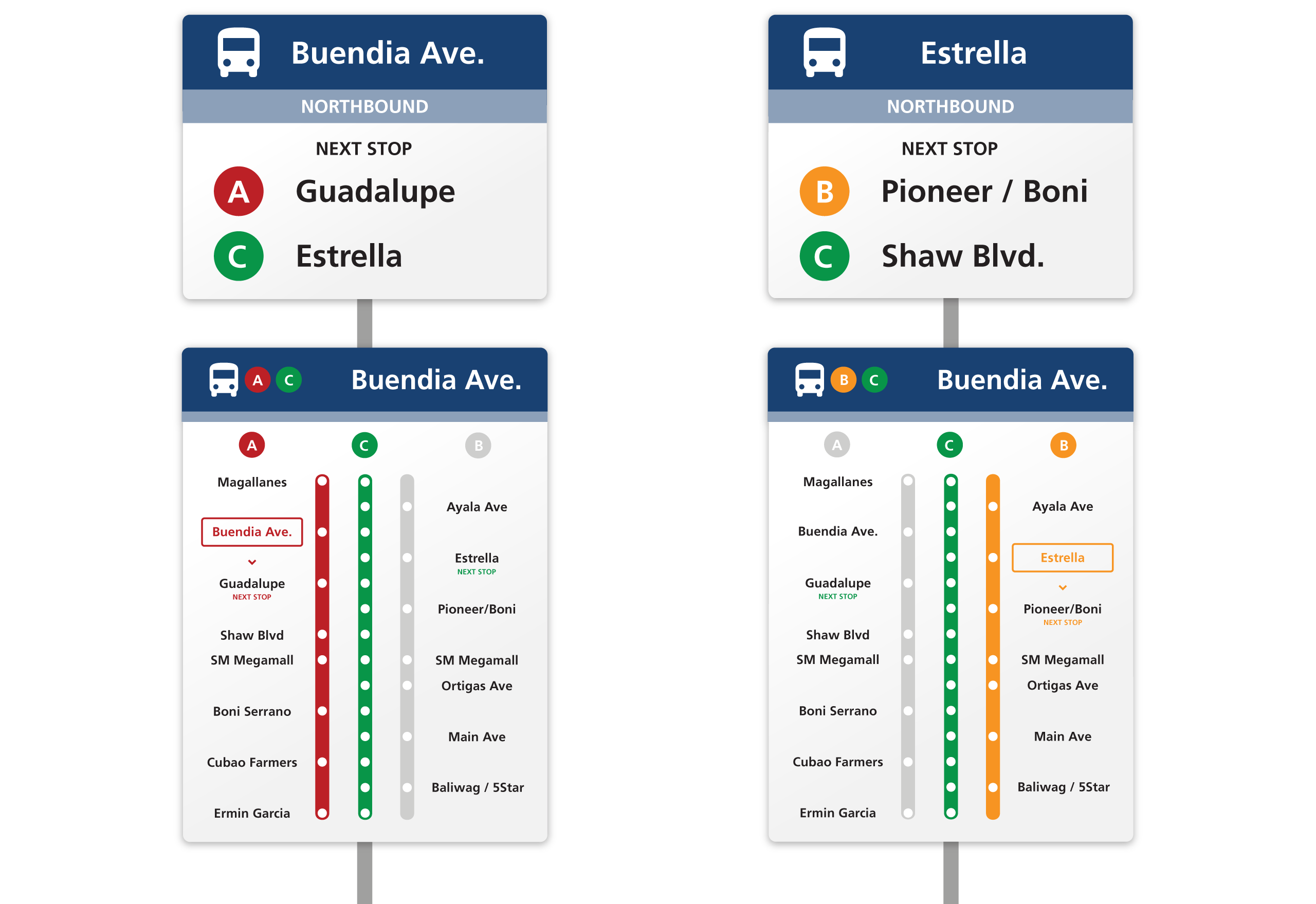
We changed the simple route directory into a more detailed infographic. Previously, it was just a list of stops, but now it visually describes the relationship between the ABC lines. (It might not be clear to new commuters that stops along the A and B lines alternate, and the C line stops on every station.) The new signage makes it much more understandable, and also highlights the current location and next stop.
Route Map
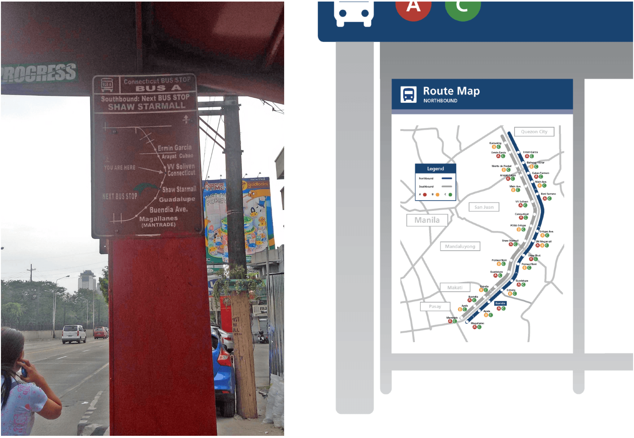
Next up, we have a map of the EDSA bus routes. We made the map larger to make full use of the spaciousness of the bus stops. This makes it easier for commuters to read, and allows us to show more relevant information such as the buses served per stop. The redesigned map also shows stops along both Northbound and Southbound lanes of EDSA.
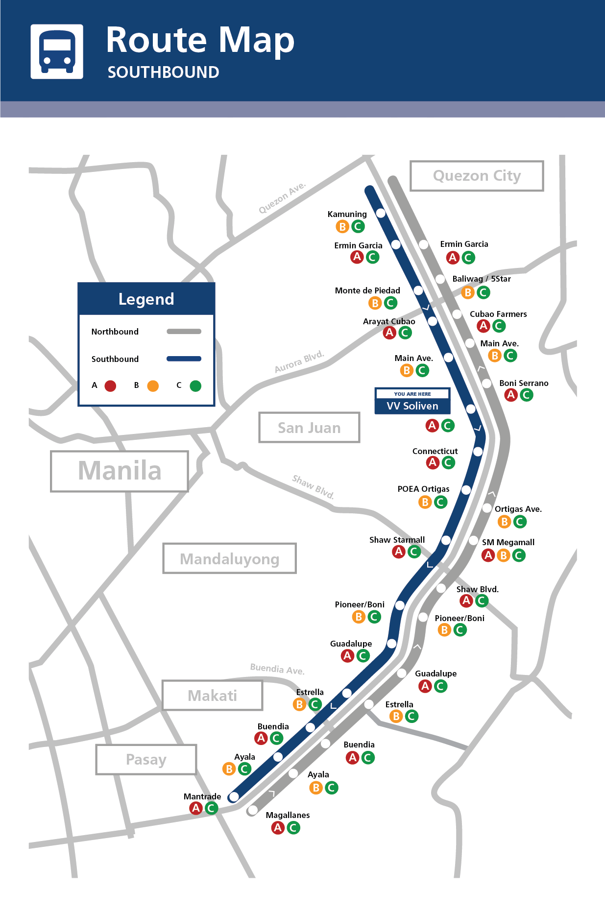
Note that in the legend, we have Southbound in color, while Northbound is grey. This is because the sign is meant to be placed on the Southbound side. Signs placed on the Northbound side will have Southbound in gray.
More importantly, the redesigned map also shows the bus routes in context. You can see which stops are near other major roads like Aurora Ave, Shaw Blvd, and Buendia Ave, and also get a feel for where the different cities and municipalities are in relation to the stops. Of course, it also shows which stop you’re at.
Locality / Area Map
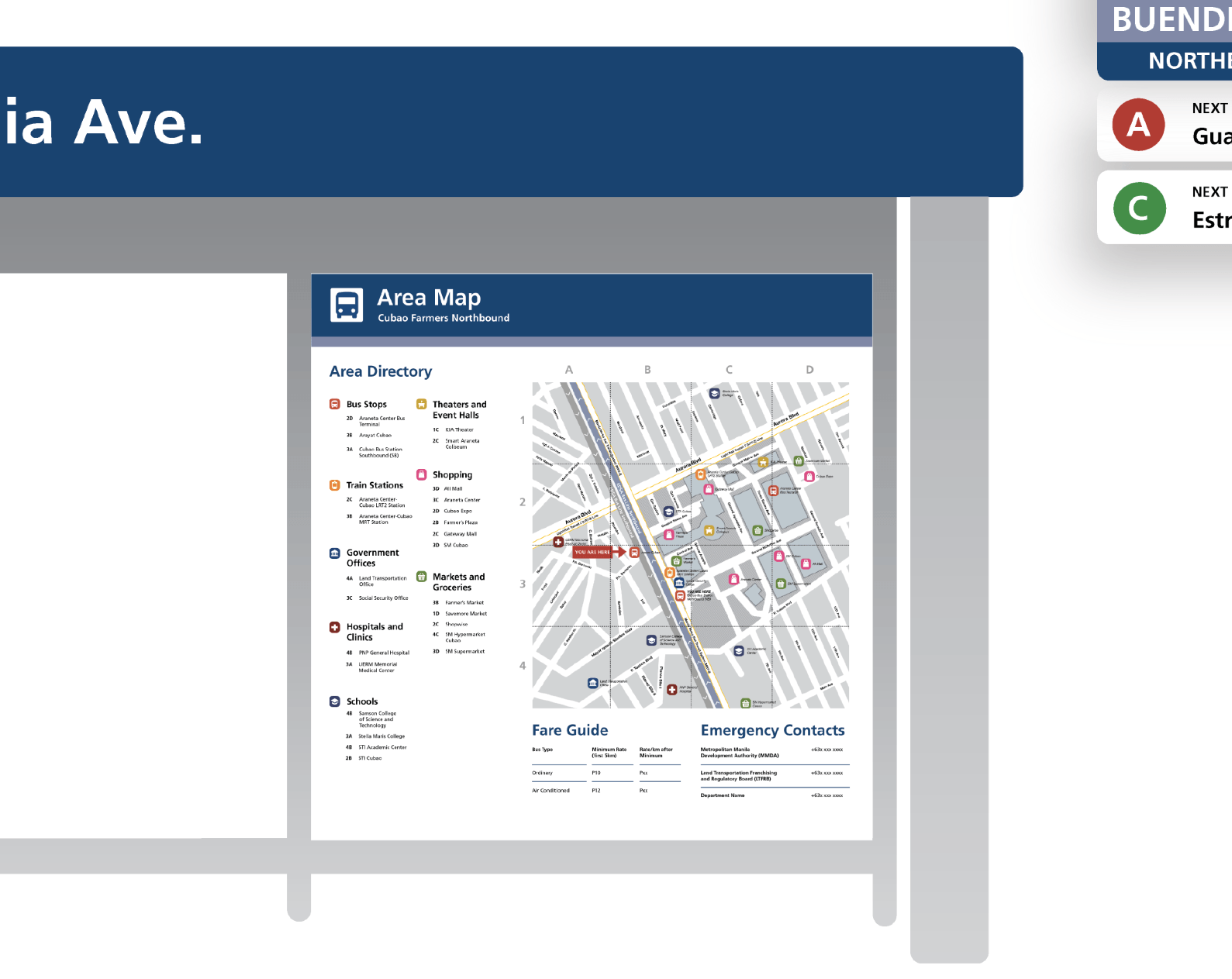
This panel isn’t a redesign, because it does not actually exist on the current bus stops. We thought of adding it because it can help commuters who aren’t familiar with the area they are currently in. Many cities abroad feature locality maps around their bus and train stops.
These area maps provide information about the area in proximity to the current stop. All streets, including the smaller ones, are clearly labeled.
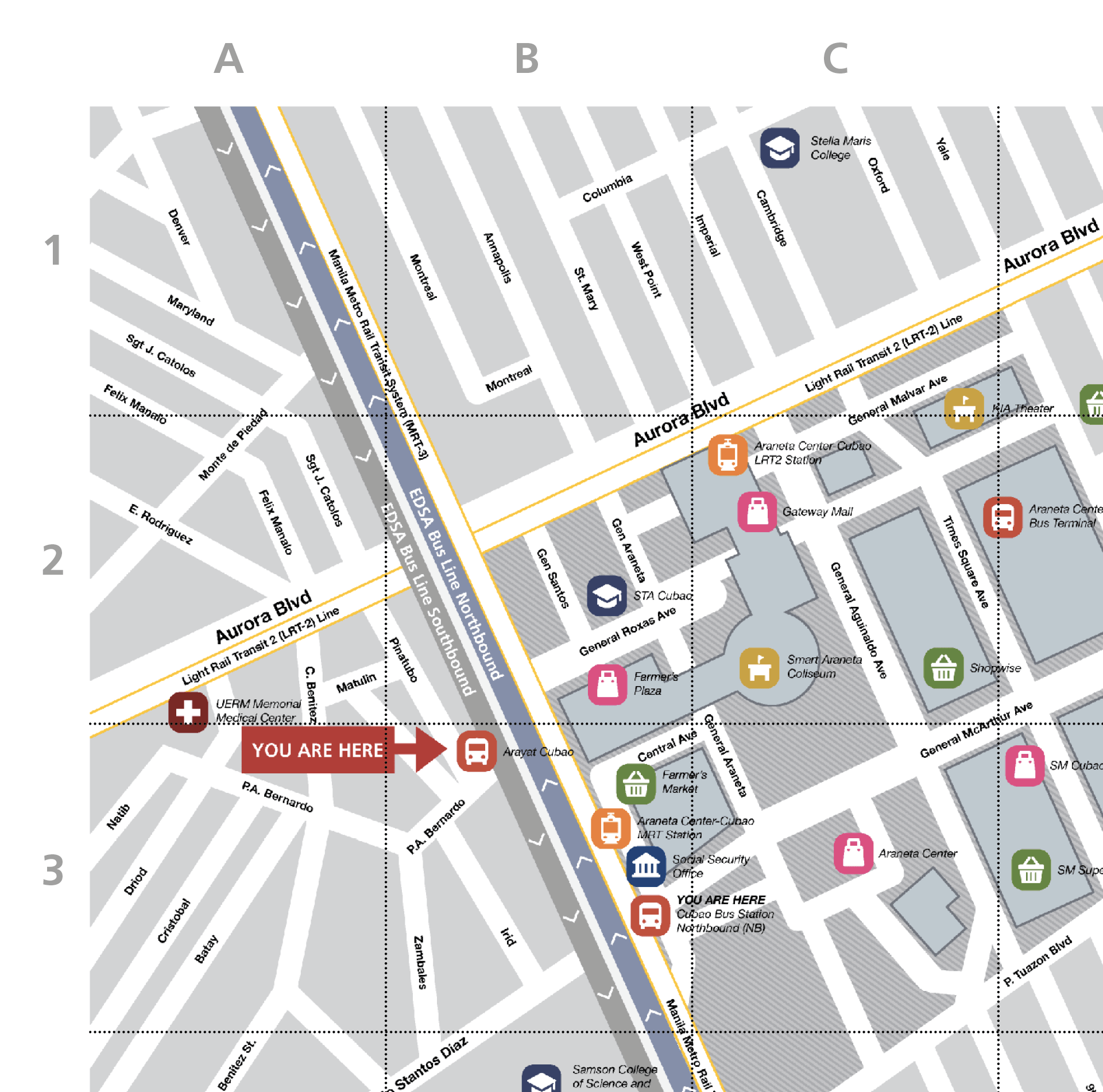
Places of interest, like malls, police stations, and hospitals, are also marked on the map. These are grouped into different categories (e.g. bus stops, shopping), and organized in a list. This directory helps people quickly find places or buildings they need to go to.
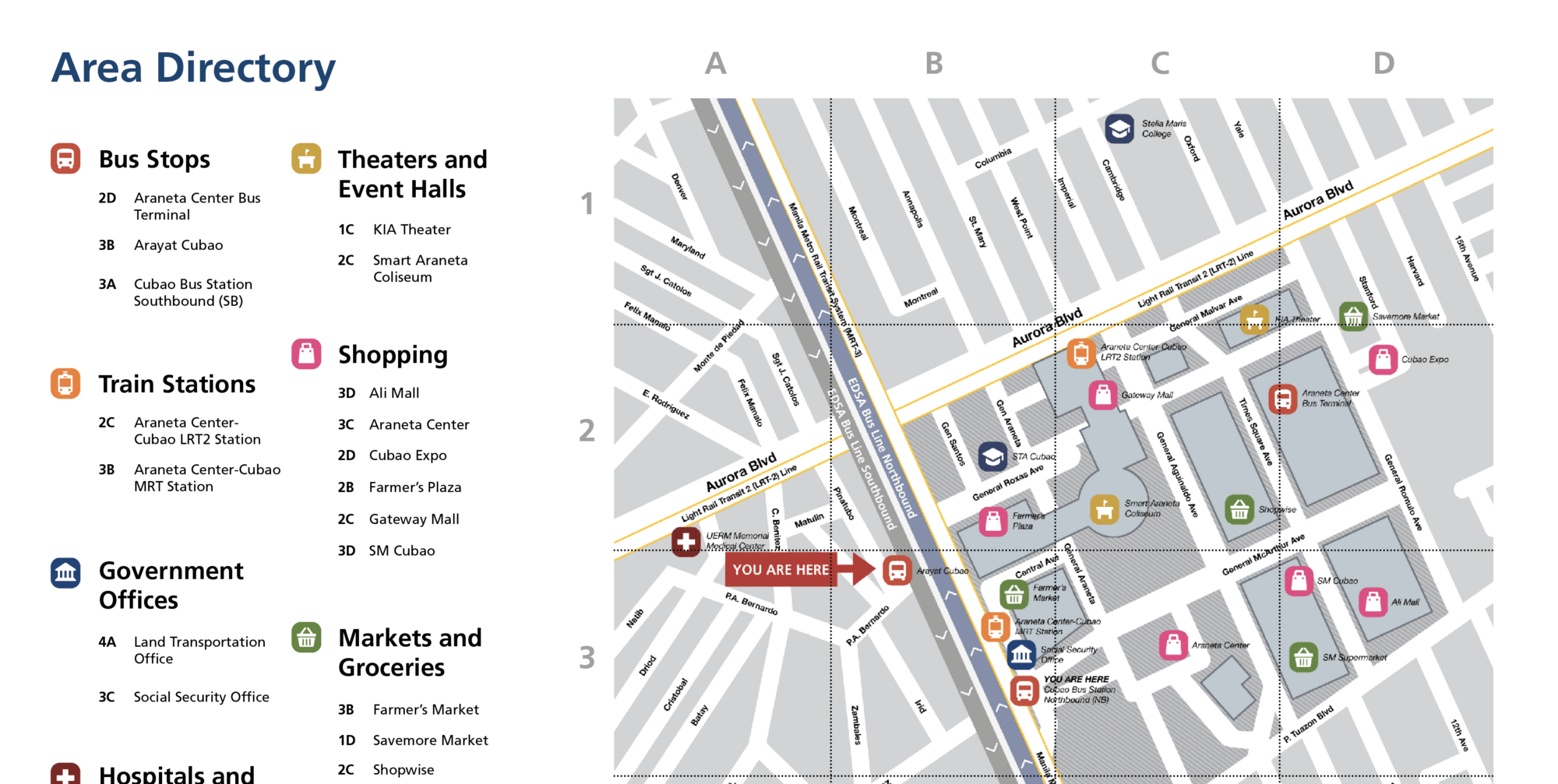
Each category has its own icon, and these icons are used as place markers on the map. A grid system is used to indicate the location of each item on the list. (A4, B3, and so on.)
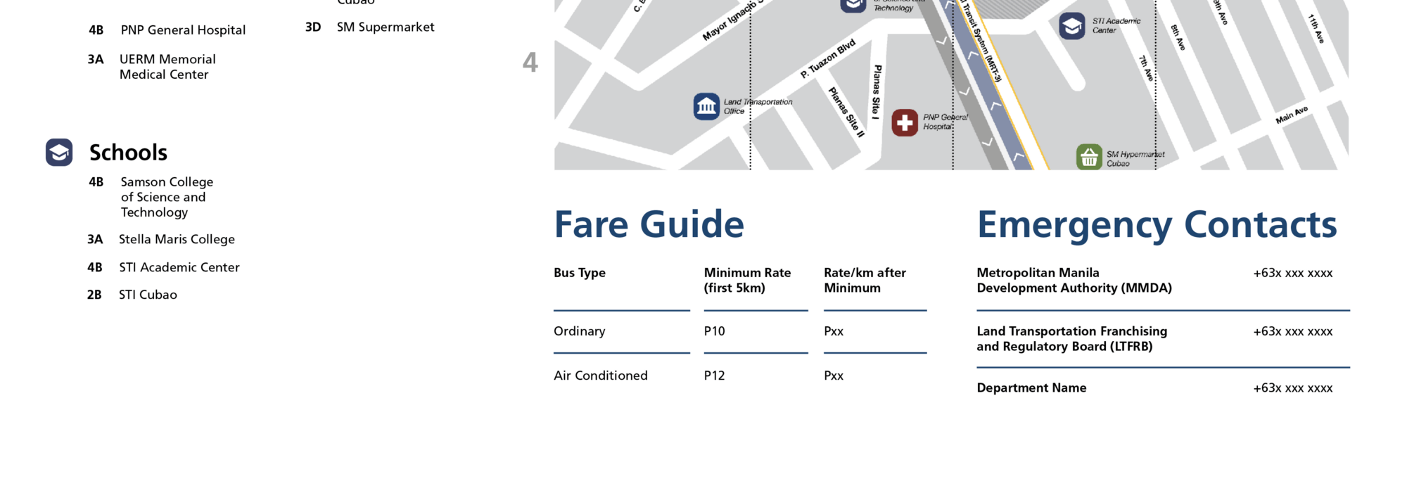
Additionally, underneath the Area Map is other information that may be relevant to commuters, like a bus fare guide, and emergency contact numbers.
Bus Stickers
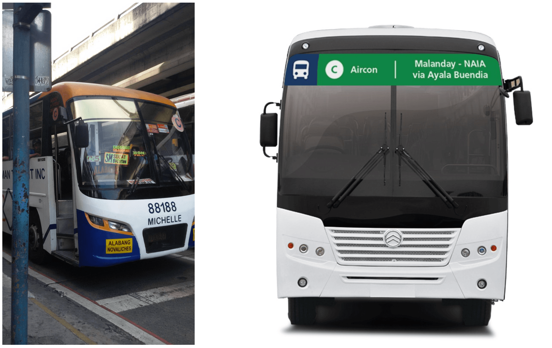
Before (left) / After (right) — image source
Next up are the bus stickers. We made them larger than the current ones, to emphasize the information that commuters need, such as the bus type, bus route, and whether or not it is an air-conditioned bus or an ordinary one. This makes it easier for users to determine where the buses are going.
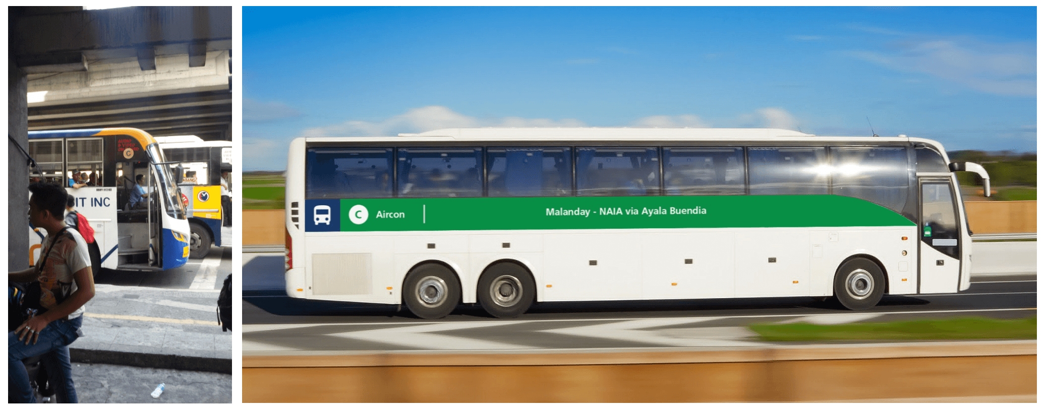
Before (left) / After (right) — image source
The windshield stickers are placed on the right side of the bus since it is closer to the sidewalk, making it easier for the commuters waiting in the bus stops to see.
The stickers’ colors predominantly correspond to the type of bus (A, B, or C). The large size of the stickers along with the bus type colors, would make it easier for the commuters to identify what type of bus is approaching from far away.
Closing Thoughts
We’re quite happy with how this little side project turned out. This is an exploratory study we did for fun, and not an officially commissioned project by the MMDA, DOTC, LTFRB, or any other four-to-five letter acronym. There were no real-world constraints imposed on the design, so there are likely many factors we are overlooking.
This was an interesting exercise in designing outside the screen. Most of our work deals with design for interfaces, interaction, and data visualization on computers and phones, so this was a nice change of pace. The project also served as an illustration of how big problems can be tackled from a variety of angles. If we really want change, we shouldn’t limit ourselves to the media or contexts that we’re most familiar with.
Impact
The Demand for Public Transport (pages 91–95), a widely-used study on British commuting, suggests that good passenger information is an important factor in the success of a public transport system. Their research says that commuters rate customized local information at stops as the highest-value type of information facility. The same study suggests that improvements in the quality of information provided lead directly to an increase in the monetary value provided to commuters by the presence of public transport. (Obviously, this is a study from a different culture and context, but it is illustrative of the idea that these small changes can help a great deal.)
Hopefully, this serves a reminder that design is ultimately not about decorating or improving aesthetics, but about solving problems, and communicating properly. (But making things pretty does tend to help a lot in making things work.) Hopefully, we were able to properly communicate and document our thought processes in this article.
As always, hit us up on Facebook or Twitter to let us know what you think, or leave a comment on the Medium Post. Feel very, very free to reshare this, comment on it, discuss it, and talk about what you liked or didn’t like.
Yours,
Philip Cheang,
Monica Esquivel, and
Inna Tan
Sakay.ph
Acknowledgements
Mon and Inna spearheaded the design and went through many iterations at the behest of Phi and Rodz, who mostly stood over their shoulders. Some supporting materials by Phi. Patsy made that one infographic.
Many thanks to Kenneth, Rob, Kitkat, Jules, and others for their feedback and input on this piece.
Some of our mockups are based off other people’s photos, which we have attributed inline where they appear. Much appreciated.
And finally, thank you for reading this! ❤
