Introduction
Hello, Wil here! I handle deployment of the iPhone and iPad app of Sakay.ph, among other things at By Implication. One of these many things is data science and analysis.
High-level data analysis involves a lot of math, but we can start with some basic exploratory data manipulation and visualization. A brief, cursory look at the data can already provide a fair bit of insight.
The data I'll be discussing is based on searches made on Sakay.ph from September 29, 2013 until August, 30, 2015. This data contains only the addresses of the origin and destination in plain text, as well as the location in terms of longitude/latitude (WGS 4326). In the interest of user privacy, we did not account for whether searches are made by the same user, or by different users.
Service Areas
Since Sakay.ph only works within Metro Manila (for now! ;), one of the things that we're interested in is how many searches fall inside and outside our service area:
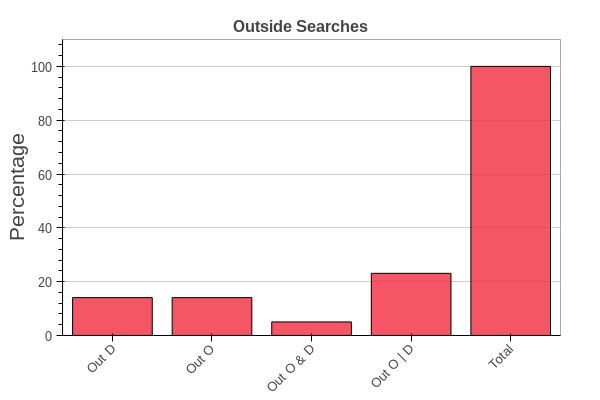
Note that Out O & D means queries with both origin and destination outside our serviceable area. While O | D means queries with either origin or destination outside our serviceable area.
From this, we see that can't give results to nearly 25% of queries! We need to expand our area! But to where? Let's look at a random sample of the queries:
| Origin | Destination |
|---|---|
| Magellan's Cross and Pavilion, City Hall Lane,... | Taboan Public Market, Cebu City, Central Visay... |
| evangelista bangkal | dfa ermita |
| Capas, Central Luzon, Philippines | Lipa, Batangas, Calabarzon, Philippines |
| Salawag, Dasmariñas City, Calabarzon, Philippines | datu esmael |
| Francisco Bangoy International Airport, Davao... | bus Davao, Davao Region, Philippines |
| 420 Eglinton Avenue East, Toronto, ON M4P 1L8,... | Lingayen, Ilocos Region, Philippines |
| Los Angeles, CA | Miami, FL |
Besides provincial Origin/Destination, we also have incomplete search terms and international Origin/Destination. The international queries do stand out, but upon further investigation, they only amount to approximately 1.0% of the queries. As such, we probably don't need to start accommodating international queries any time soon.
Trends
One thing that would greatly help traffic planning is knowing when people commute and to where. This can help planners allocate transportation resources. Since our data only contains queries and not actual travel trajectories, we can only track intent at best. We should keep this in mind while looking at patterns that emerge.
First, we have the number of queries per day of week:
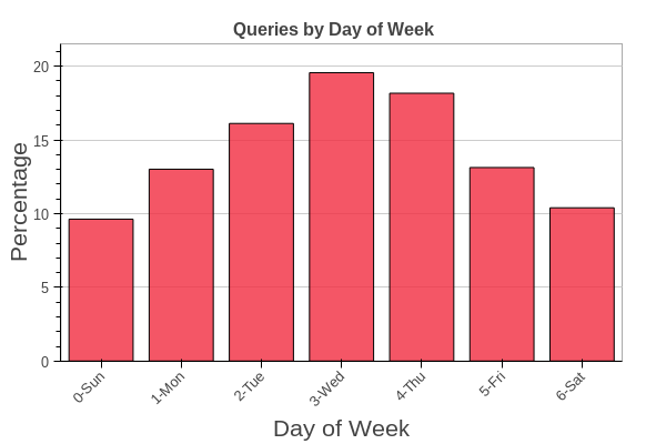
A lot of our searches happen mid-week. Interesting, but not particularly insightful. Something potentially more useful is the number of queries by hour of day:
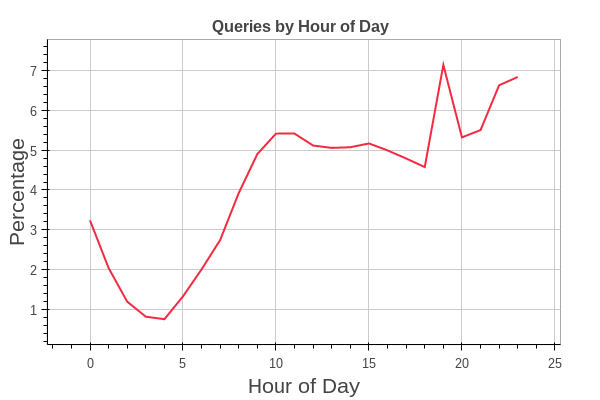
(These times are based on Philippine local time, GMT+8.)
Notice that the trend follows usual human activity over the day: the queries starting low early morning and building up as people wake up. The number of queries peak in the evening at 7:00PM which caught our attention since it's jutting out of the graph, suggesting a possible anomaly.
Upon inspection of the logs, we found out that there was one time where queries got stuck in the queue and a lot of them got processed at around that time. However, after removing those queries, the graph still shows the same trend.
Either way, we can clearly see that a large number of people use Sakay.ph at night!
Map Visualizations
Plotting the query locations over time is also helpful for analysis. My first stab was to draw lines from origin to the destination with overdraw blending, for each search. The result looked something like this:
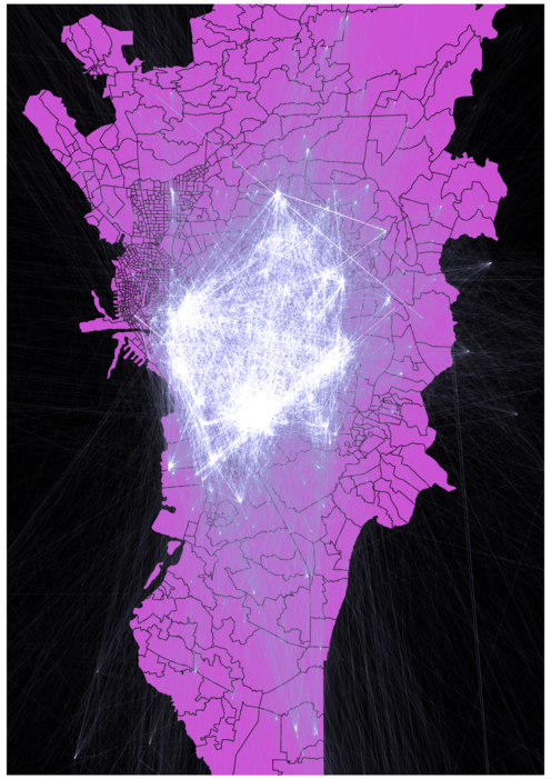
Though you can spot the queries outside Metro Manila, everything else looks messy. While I can attempt to reduce the amount of overdraw by doing random sampling, I decided to do something else and generated a heatmap of the origins and destinations (as usual, red means "a lot of people"):
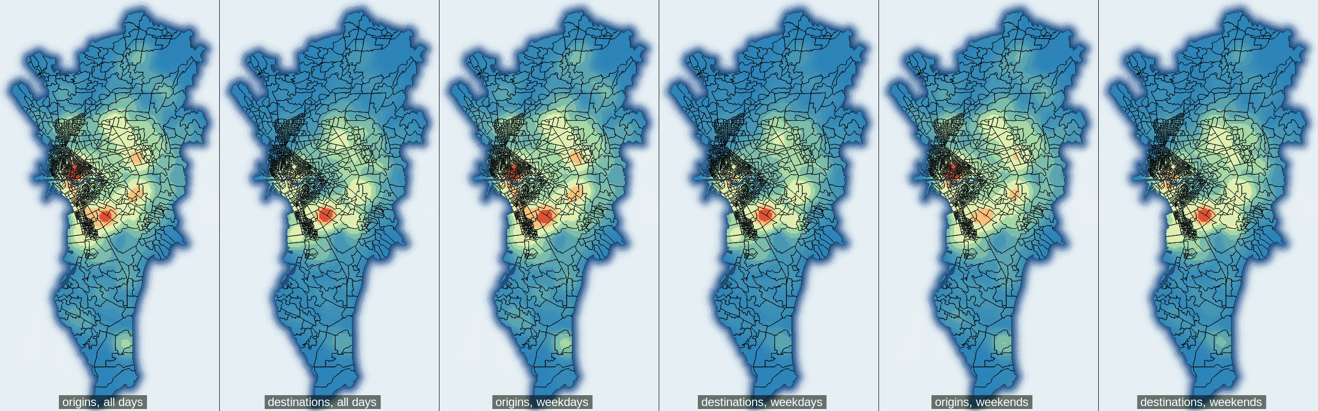
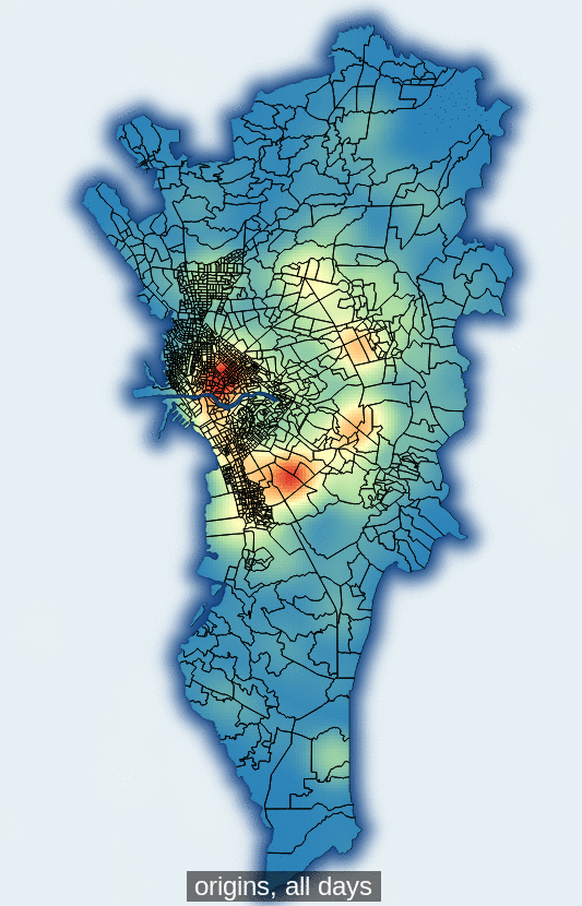
Pictured above is one heatmap for all days, and separate heatmaps for weekdays and weekends.
An interesting pattern we can see is that while there are multiple "hot spots" (areas of high concentration) for origins, such as Cubao, Ortigas CBD, Manila, and Makati, destinations are largely concentrated in Makati. This trend does not differ much between weekdays and weekends.
Another way to visualize the maps is by simply drawing the origin and destination locations with additive blending. Origins are colored red and destinations blue and when an origin point and destination point overlap, they blend to white. Have a look:
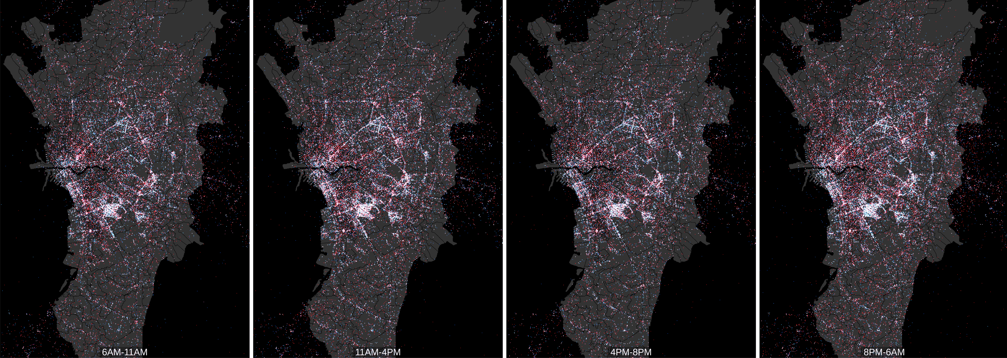
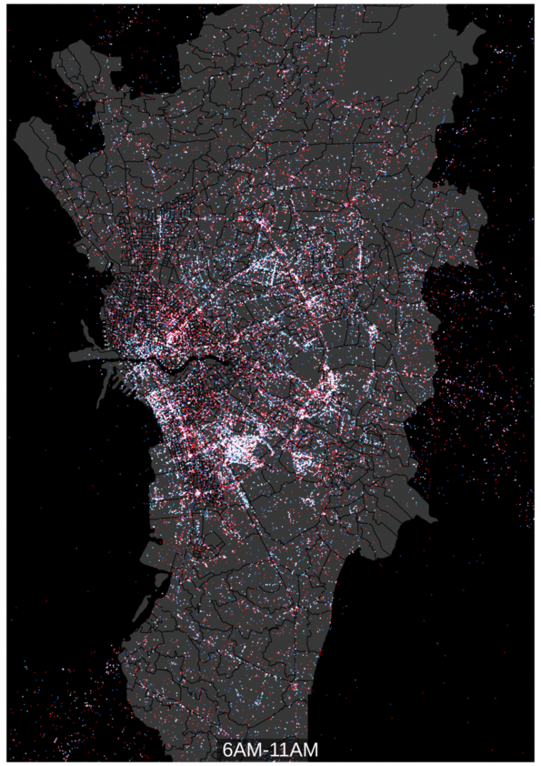
Unlike the heatmap which is timesliced by day of week, the point visualization is timesliced by hour of day instead, because there isn't much difference in a day-to-day comparison.
The density of the points mimics the heatmap. However, aside from the high density areas mentioned earlier, we also see other notably hot areas, like QC South Triangle and Marikina.
Moving Forward
This is a first pass at deriving insight from the searches made on Sakay.ph, and is a very simple look at the usage patterns of Metro Manila commuters who use our app. (Everyone wants to go to Makati. Wow, who knew?)
These visualizations and analyses are based on very simple origin/destination information, and the time/day that these searches were made. We've just released our big update last month, where users can submit error and incident reports, which should hopefully generate some additional, interesting data. (Please use it!) We've also been in talks with various local agencies, and while we have nothing to announce at this time, we can say that we are pretty excited.
All-in-all, we expect to generate more data with the new features and partnerships that we are building, and to deriving even more (hopefully) useful data and analysis. We look forward to sharing these insights with you, and to helping improve the commuting experience in Metro Manila (and soon, the rest of the Philippines).
